Creating unity through innovative design
How can design improve the user experience and usability of a platform?
Any design team knows that finding the intersection of form and function is essential to get people to use your product or service. In a sector as important to our society as healthcare, this is as vital as ever.
EvidenceCare, a data-driven healthcare finance and records platform, first approached Territory with a straightforward request: to create consistency and cohesion across design and brand elements. This included style, taxonomy, and branding for the logos and app components of a series of platforms that aim to make caregiving easier and more effective.
Designing a cohesive brand experience
We are often asked to lead a discovery phase with our clients to help them refine their vision and objectives. However, this time, EvidenceCare came to us with a nearly complete concept of their desired outcome. This level of clarity allowed us to focus our efforts on the design itself, letting our team’s creative talents truly shine.

Each logo needed to appear clearly as part of the same business family but still distinct from each other. For example, picture the Microsoft Office suite. Each program (Word, PowerPoint, etc.) has a unique icon, but all are obviously owned and operated by the same company. This is the feel EvidenceCare hoped to achieve.

Innovating for data transparency and ROI
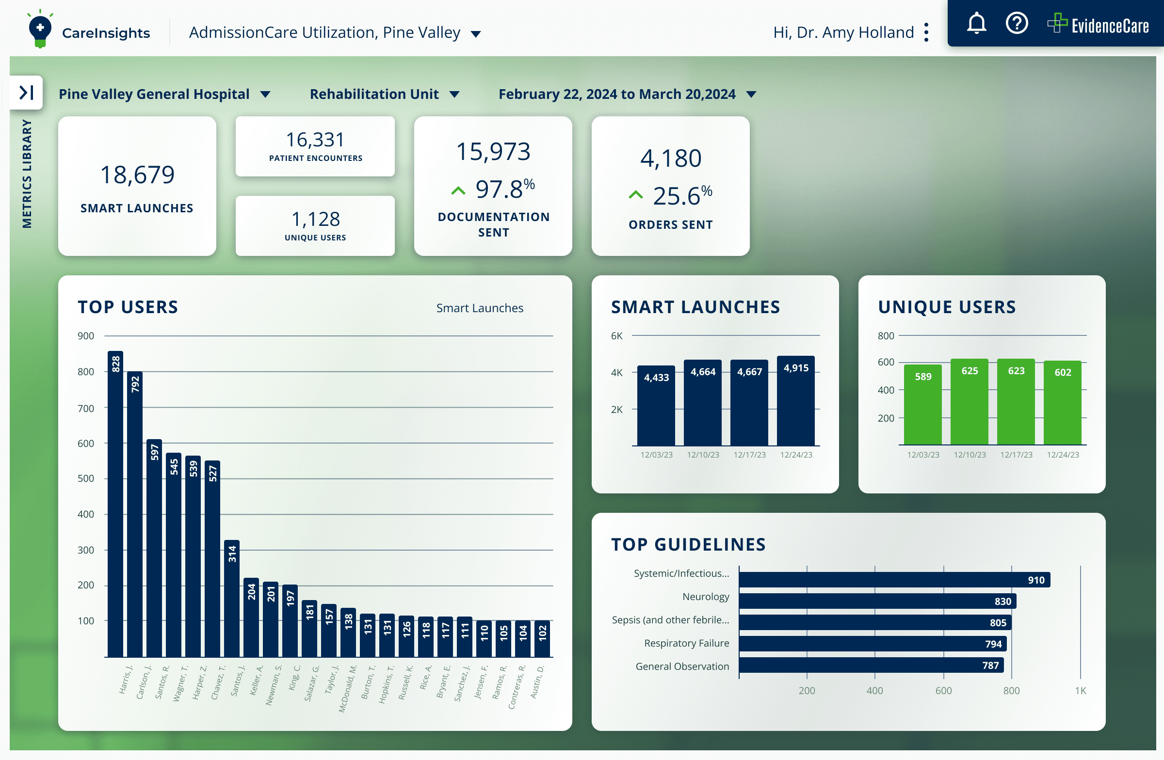
After this success and immediate implementation of the redesigned components and logos, EvidenceCare sought Territory’s assistance in the development and design of a new platform called CareInsights. CareInsights combines the clinical and financial data to support physicians, primarily hospitalists, and administrators, to make informed decisions about patient care while having the ability to see a larger perspective of medical capacity and gauging the efficacy of their systems and staff.
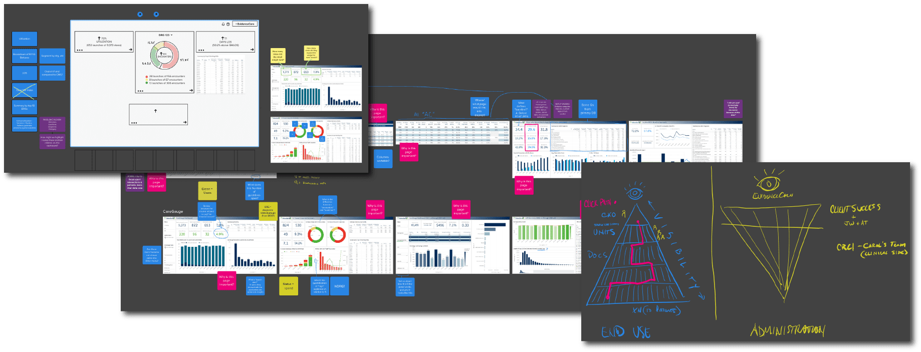
We began by conducting a series of interviews with key EvidenceCare team members to gain a better understanding of what they were looking for and help create an aligned vision. After reviewing the current practices, provided data points, and prioritizing essential functions for success, we were able to facilitate the UX/UI decisions that would produce the most usable version for potential end-users.
In an ideal world, we would have been able to take our first design and turn it into reality, but reality—and technology— have constraints. When we began to work with the developer, we discovered that certain elements were not realistic or possible to implement. This allowed us the opportunity to collaborate and create a shared vision of a finished product that is not only optimized for the user experience visually but also functionally.
Additionally, we had to make sure that the entirety of the CareInsights software was consistent with the design of the app family we had worked on previously. A cohesive brand experience offers recognition, consistency, and an improved user experience overall. The final design reflects these efforts.
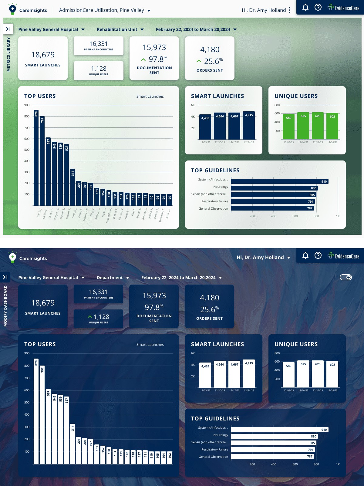
After creating successful prototypes, we were able to successfully collaborate with the EvidenceCare team and developers to construct a clean and cohesive UX/UI design for CareInsights. This partnership showcased our design prowess and commitment to creating user-friendly solutions that meet the needs of both the client and their end-users.
“The goals of this project were to unify the apps, make sure they look like they came from one creative influence, and maintain all the functionality we have right now. This checks all the boxes for me.”
Jim Hitch
Director of Product


