The intricacy & intimacy of brand definition
Recently a long-time client and partner came to us with the most personal of business asks: help define my brand.
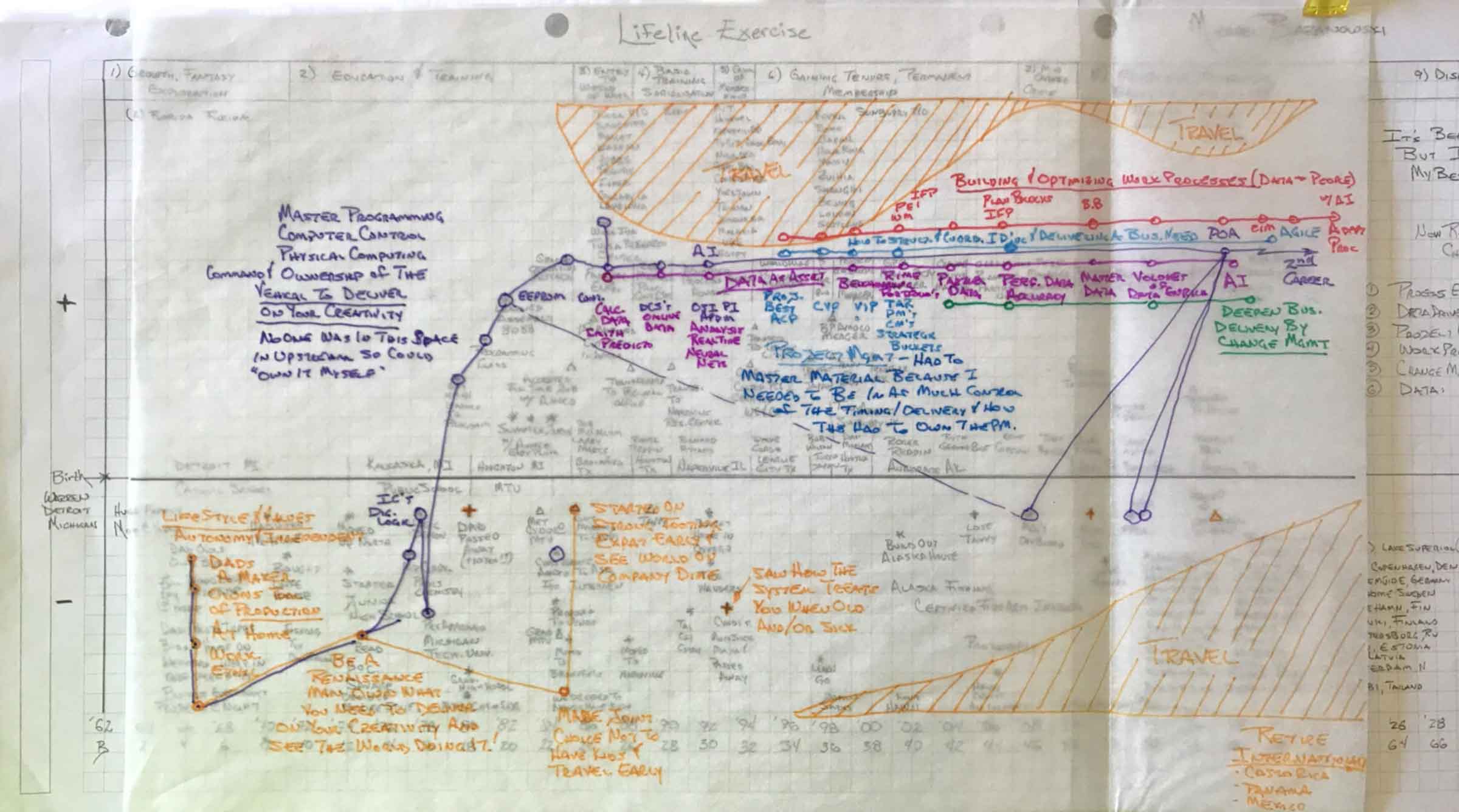
Professionally speaking, we’re all on a journey. One person’s path might be straight as an arrow, growing into new roles in a single organization, while others take a more indirect route through jobs, disciplines, and even continents. This latter path best describes the career of our friend, Mike.
The ask
Mike spent decades exploring, so to speak, and on the occasions, he couldn’t fulfill his drive through his job, he directed his energies into passion projects as an entrepreneur and inventor. He came to us seeking a visual mark to tie together his vast works.
Through this time and experience, Mike has honed an uncanny knack for placing himself at the apex of change. Being an engineer in mind and a designer at heart, he wanted a mark for the artifacts he created to help the teams he leads.
“I’ve coined for myself the title, “enterprising pathfinder,” in an attempt to reflect an infectious enthusiasm and adventurous, avant-guard spirit.”
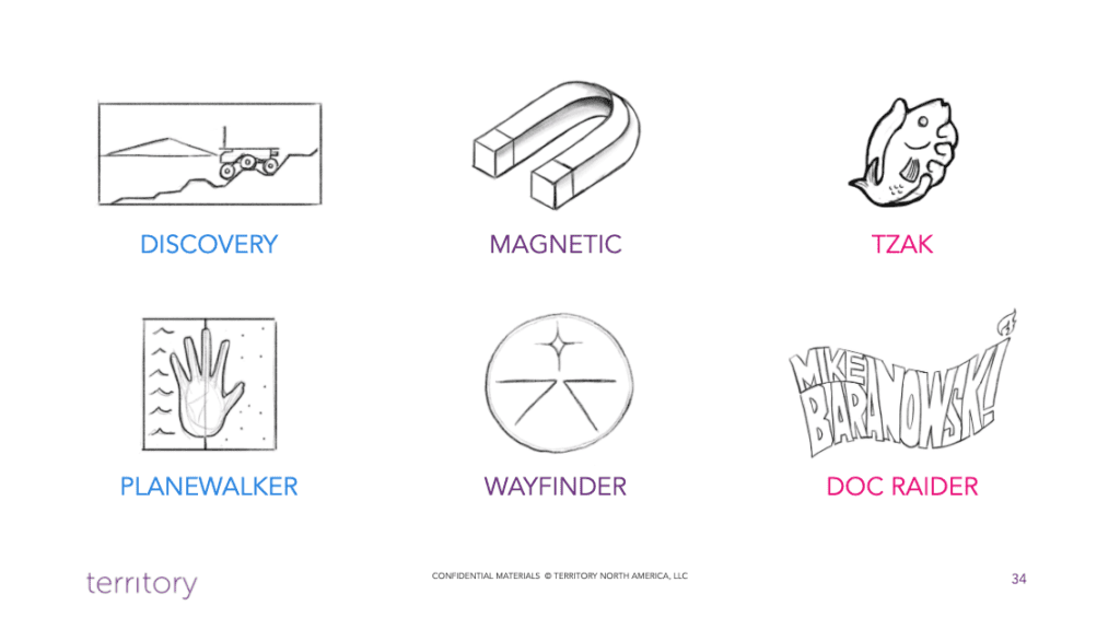
Inspirations for our work included the adventure novels he devoured as a youth; cultural icons such as Indiana Jones, Tony Stark, and Lara Croft; humanity’s missions to Mars; and the mystical Mayan concept of Tzak.
Our approach
 When creating a logo or visual mark of any kind we believe that your logo isn’t just a picture—it’s your brand. It’s the singular definition of you, your product, your business, or your service. Since we all view the world from our own unique mix of experiences and emotions, a logo as a simple visual cannot be understood in exactly the same way by everyone and, therefore, should not present a story, equation, or puzzle known only to you.
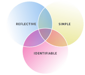
Your logo is for your audience. It should represent what you offer, yet doesn’t need to be an extension of your person. We believe there are three hallmarks of a quality logo. Your logo should be:
- IDENTIFIABLE — Your logo should be relatively unique to your audience
- REFLECTIVE — It should represent your offer
- SIMPLE — Reproducible at scale
The process of creating a logo should be both interactive and collaborative and is often very iterative. When done well, honesty and shared trust drive the creation of a visual mark that speaks truth to both owner and audience.
The solution
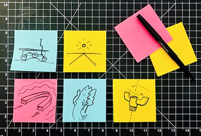
Starting with quick sketches created during our discovery conversations, we set to work drawing the initial concepts, each representing variations of key elements: balance, influence, wayfinding, and proficiency that borders on the mystical.

Through our conversations and iterations, we found that Mike needed two marks: one for his current state and a second to reflect his fiery aspirations.
The first mark would be fun and intrepid—a reflection of his adventurous youth. The final banner design quite literally shows his name braving the winds of change and lighting the way by torchlight into the unknown. The following images show some of the thumbnail sketches created during discovery conversations, the process of hand-drawn form definition, and the six initial logo concepts.
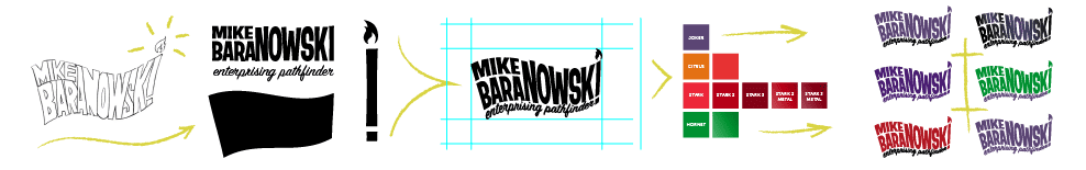
Logo #1: The evolution of “Doc Raider” concept from sketch, to refined form and selection of colorways
The future-forward mark was decidedly more mature and thought-provoking. Its refined form is a three-part balance of science, nature, and curiosity. The central theme is a floating orb representing both accrued wisdom and a holistic and reflective view of the surrounding world. The orb is bound in place by a 1.5 twist Mobius strip reflecting structure, formula, and interconnection.
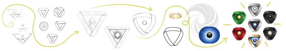
Logo #2: The “Reactor” form was created by combining elements from three of the original concepts and a number of new ideas and textures
Both marks adhere to our brand tenets. They are clearly identifiable through form, color, and texture—each evoking their own unique mix of impressions to the viewer. Both marks are reflective of the person—both the spirit of his brand today and a vision of aspiration. And, finally, each of the designs are simple in concept and execution, a point hit home when reducing each mark to its single color bug form.
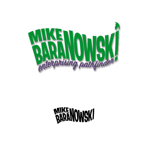
Logo #1: The active form and bold coloring of our final design leave a powerful and spirited, almost irreverent impression that no challenge is insurmountable.
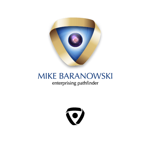
Logo #2: Harnessing the power of natural forms such as a sphere, Mobius strip, and the golden spiral, our final design depicts a balanced source of energy and sparks a sense of wonder.
