Using visual thinking to map complex systems for clarity
Global organizations drown in complexity. In the midst of that complexity, it can be easy to end up misaligned, and misalignment can be incredibly expensive. In this sense, clarity is money. Clarity greases the wheels of communication, enhances and accelerates work, and empowers employees to work creatively, in the right direction.
The Ask
 Our client sought to increase understanding of the complete—and complex—lifecycle of its data centers, including the roles, responsibilities, and hand-offs that enable operational excellence at all stages of operations. They asked Territory to design an inspired prototype which could be used by the entire organization to understand every key element of data center operations. The prototype is being socialized with leaders to build consensus on the importance of developing this clarity-bringing organizational tool.
The Solution
Our mission was to design a prototype that clearly demonstrated the value and functionality of the data center operations site to:
- Align on roles and responsibilities for core teams that work together to deliver value to the data center business.
- Clarify, socialize, and refine the understanding of data center operations to engage the organization’s leaders and employees.
- Give users clarity on employees’ roles and responsibilities, key phases of operations, metrics, touchpoints, and handoffs.
 To meet our challenge, we employed progressive disclosure to ease the cognitive burden of content- and feature-rich design. Nesting information allows for better understanding, focus, and productivity.
We began by brainstorming the top-level actions (L1s) in the process of building and maintaining a data center. We then went one level deeper, adding sub-actions (L2s) underneath each primary action. Throughout this process, we used visual tools to help us brainstorm, to ensure that we were aligned, to prioritize and track changes in our thinking, etc.
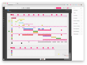
Once we had a settled set of L1s and L2s, we then mapped primary and secondary responsibility for roles within the organization to each L2. This gave us a visual map of the flow of work from one team to another in the organization, and allowed us to quickly check for errors or anomalies. We then agreed on what content belongs on each L2 page, including roles, responsibilities, dependencies, timeframes, etc.
With this insight and knowledge, we then moved into iterative design, structuring web content within tiers to allow for prioritized information that’s easier to absorb, comprehend, and retain. We determined the experience flow and defined and aligned on the core elements of the experience and initial framework, including written word and sketch walk-through.
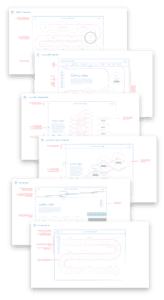
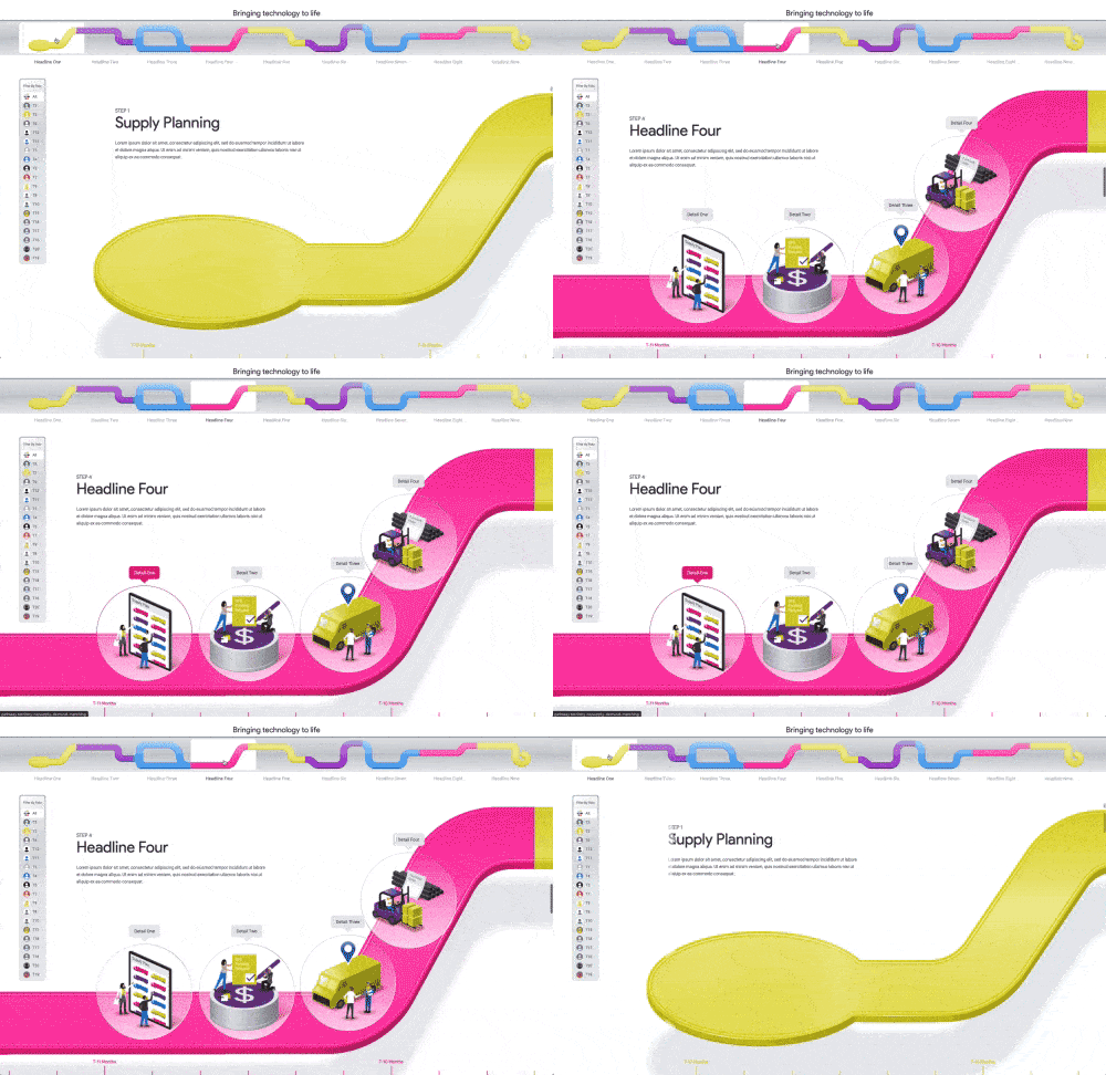
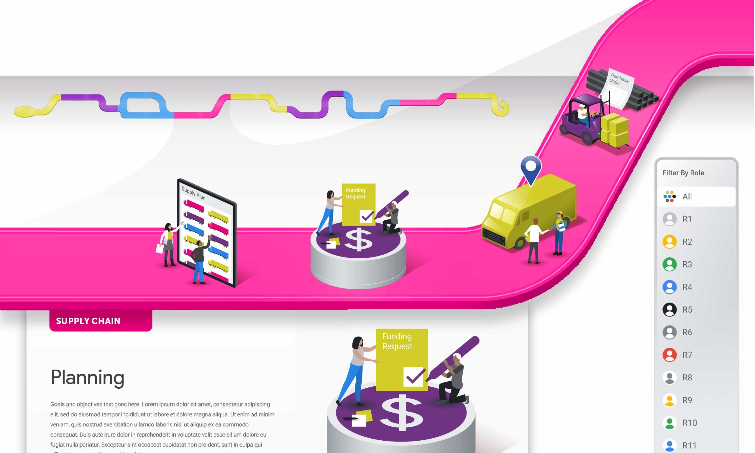
Next up was the creation of wireframe screen samples depicting different screen types, experience design, interaction patterns, wireframe design, and information architecture. Based on selected wireframes, Territory created full design comps of the interface look and feel, user-flow diagram, a feature and functionality outline for production. All this creative collaboration culminated in the design of the site prototype allowing users to click to example screens at each level of the site, demonstrating functionality, look, and user experience. Every part of the project is designed to be flexible for future development and evolution.


